Colour harmony for nail art: a designer’s guide
How the colour wheel, a few classic harmony rules and a sense of proportion help you combine shades across ten small canvases.
A single shade on ten nails is easy to love. The moment you add a second or third colour, the hand becomes a composition, and composition has rules. They are not strict laws but reliable guides that painters, textile designers and interior designers have used for centuries. This guide translates them to the scale of a fingernail, so you can combine shades with intent rather than by luck.
Why ten small canvases need a plan
Nails are small, but they are never seen alone. They sit against skin, move with the hands and appear next to clothes, jewellery and everything you hold. A combination that looks lively as a row of bottles on a shelf can look busy once it is spread across two hands. Harmony is simply the sense that the colours belong together.
Designers reach that sense by looking at three properties of colour. is the colour family itself: red, blue, green. is how light or dark a colour is. is how intense or muted it looks. When a combination feels wrong, the problem is often value or saturation rather than hue.
The colour wheel, from Newton to your nail desk
Isaac Newton arranged colours in a circle in his book Opticks, published in 1704, and the modern colour wheel descends from that idea. The circle is useful because distance on it predicts relationships. Colours close together share an underlying hue and feel related. Colours far apart create contrast.
Later teachers refined the tool. Johannes Itten, who taught at the Bauhaus, described seven kinds of colour contrast in The Art of Color, published in 1961. Among them are the contrast of light and dark, the contrast of warm and cold, and the , which concerns how much of each colour you use. That last idea matters greatly on a hand, as you will see below.
Five harmonies that work on nails
Each classic harmony creates a different mood. Here is how they translate to a manicure, with a starting point for each.
- Complementary: two hues opposite each other on the wheel, such as violet and yellow. The contrast is high and lively, so use one as the main shade and the other sparingly, perhaps as a fine line or a single .
- Analogous: neighbours on the wheel, such as coral, peach and soft gold. Calm and easy to wear, and ideal for a gradient that moves from the thumb to the little finger.
- Triadic: three hues evenly spaced around the wheel. Playful and bold. Soften the effect with muted versions of all three, such as terracotta, sage and dusty lilac.
- Split complementary: a base hue plus the two neighbours of its opposite, for example navy with coral and apricot. You get contrast with less tension than a direct complementary pair.
- Monochrome: one hue in lighter tints and darker shades. Quietly sophisticated, and forgiving when you are new to combining colours.
You do not need a printed wheel to work with these harmonies, though a small one pinned above your workspace speeds up decisions. Place your favourite bottles on it in your mind and the options become clear.
Proportion: the 60-30-10 rule on a hand
Even a well chosen palette can fail if every colour gets equal space. The 60-30-10 rule comes from interior design: a main colour covers most of a room, a secondary colour supports it and an accent adds a spark. The same logic works on nails.
On one hand, the rule can mean three nails in the main shade, one in the secondary shade and one accent nail, often the ring finger. The arithmetic is not exact, since five nails do not divide neatly into sixty, thirty and ten, but the hierarchy is what counts. One colour leads, one supports and one surprises.
One colour leads, one supports and one surprises.
You can also apply the rule within a single nail. A soft nude covering most of the nail, a band of deeper rose and a thin line of gold foil follow the same proportions in miniature. This is Itten’s contrast of extension at work: a strong, bright colour needs far less space than a quiet one to hold its own.
Value, saturation and finish
If a combination feels off and you cannot say why, squint at it. Squinting blurs hue and leaves value, so you see at once whether the shades are too similar or too far apart. A pale pink next to a pale lilac reads as one soft mass. A pale pink next to a deep plum gives graphic contrast.
Saturation follows a simple rule of thumb: pastels combine easily with pastels, muted shades with muted shades. One neon among several dusty tones rarely looks intentional unless it is clearly the accent. Keep the families consistent and most hues will get along.
Finish adds a further layer. Two shades of the same value can be separated by texture alone, for example a matte main colour with glossy tips. Metallics behave like jewellery, so give them the ten per cent rather than the sixty.
Building a palette, step by step
When you design a set from scratch, a fixed sequence keeps you from second guessing every choice.
- Choose the main shade, the one you would happily wear on all ten nails.
- Decide on the mood: calm (analogous or monochrome) or lively (complementary, split complementary or triadic).
- Pick the secondary and accent shades from the wheel to match that mood.
- Check value and saturation, and replace any shade that stands out for the wrong reason.
- Assign proportions with the 60-30-10 rule and decide which nail carries the accent.
- Swatch, review in two kinds of light and only then paint the full set.
Harmony is not about avoiding bold colour. It is about giving every shade a role, so the hand reads as one considered design rather than ten separate ideas.
Glossary
- Hue
- The colour family itself, such as red, blue or green, independent of how light or intense it is.
- Value
- How light or dark a colour is. Strong value contrast reads clearly, even from a distance.
- Saturation
- The intensity of a colour, from vivid and pure to soft and muted.
- Contrast of extension
- Johannes Itten’s term for balancing colours through the amount of surface each one covers.
- Accent nail
- A single nail, often the ring finger, painted differently to give a manicure a focal point.
Questions and answers
Do colour harmony rules work for nude and neutral shades?
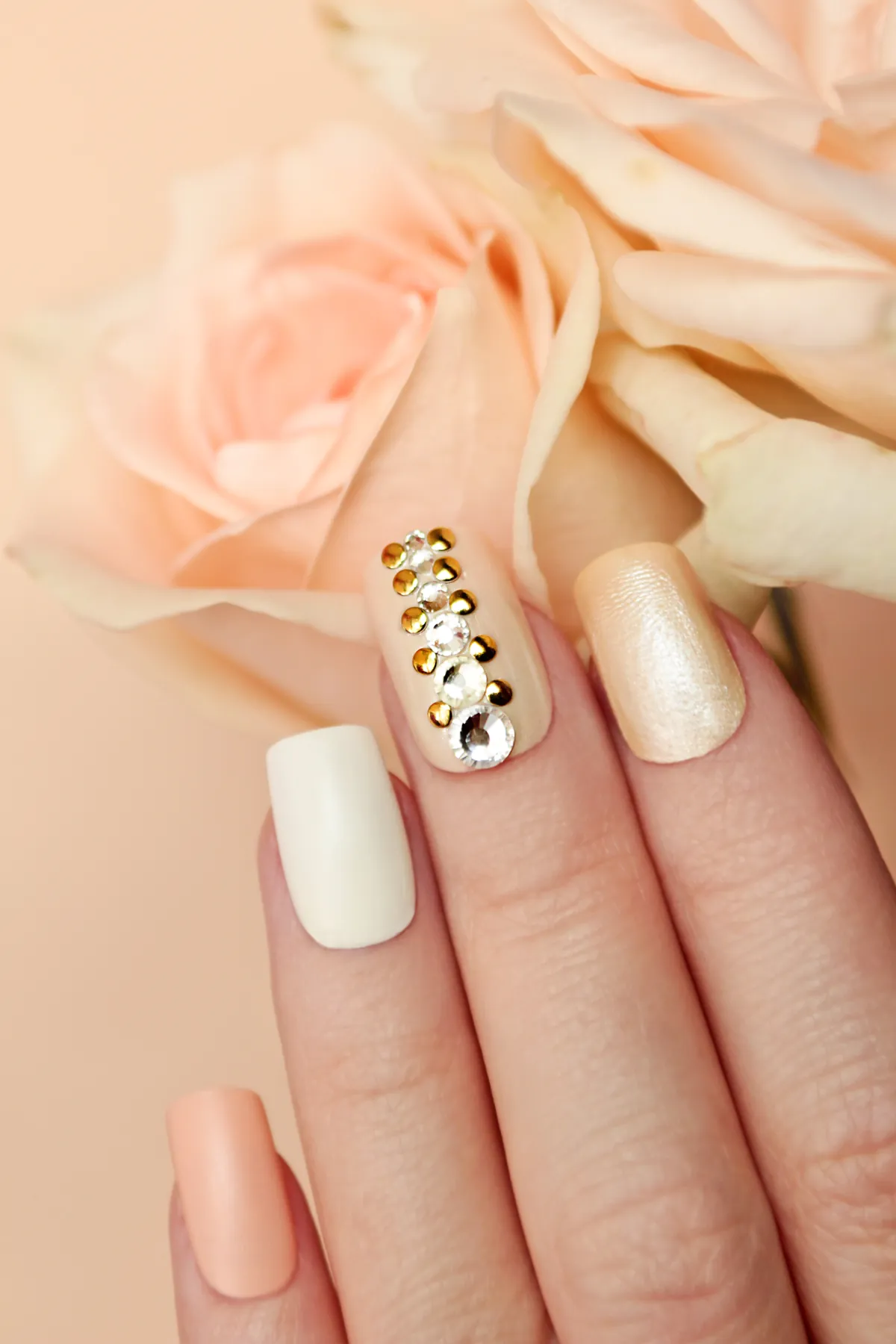
Yes. Neutrals still have a hue, usually a warm pink, peach or beige base, or a cooler grey or mauve base. Treat that undertone as the shade’s position on the colour wheel. A warm nude pairs naturally with gold, terracotta or coral accents, while a cool nude suits silver, lilac or slate. Value contrast then decides how visible the design will be.
How many colours should one manicure have?
Two to three colours give most designs enough interest without losing clarity. If you use more, keep them within one family of value or saturation so they still read as a set. A detailed nail art design can carry many shades, but it helps to treat them as a main colour, a supporting colour and accents, following the 60-30-10 idea.
Which finger is best for an accent nail?
The ring finger is the most common choice, because it sits between other nails and draws the eye without dominating the hand. It is a convention rather than a rule. An accent on the thumb is more visible in everyday gestures, while an accent on the same finger of both hands gives a balanced, symmetrical look.